“A picture is worth a thousand words” aptly characterizes that a complex idea can be conveyed with just a single graphic. Visualization makes it possible to absorb large amounts of data quickly which shows why we happily share a child’s first drawings and cards with our friends and family.
One of the many Cognitive Biases is the Picture Superiority Effect which states that concepts that are learned by viewing pictures are more easily and frequently recalled than concepts that are learned by viewing their written word form counterparts. Auditory images and motor images help memory. Aesthetics have not only been proven to improve usability, but also to increase retention.
Effective eLearning deliverables require more than just text and a few random graphics. Good graphic design, user interface (UI) design and user experience (UX) design aren’t optional – they’re necessary. When choosing graphics for eLearning or designing media to compliment textual content in eLearning, it adds great value to implement ‘communication functionality’ in the media objects used.
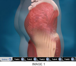
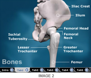
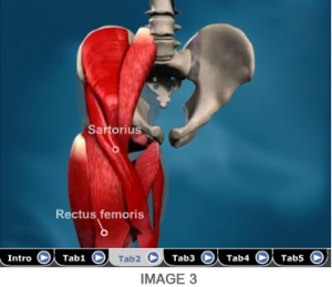
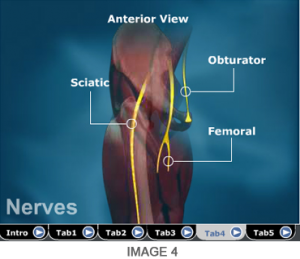
Let’s look at the images below. They present the anatomy of the human hip joint. Without any further reference, what can be perceived with the images?


It is important to note that Image 1 and Image 3 are animated videos, while Image 2 and Image 4 are static images. Irrespective of the media type, if the above images are studied in a series, they provide sequential information on the anatomy of the hip joint. The different tabs thus transition from one visual space to the next visual space. It is thus important to note that what caused learning in this case is not exactly the media type. It is the ‘communication functionality’ of the series of images that presented the complete picture.
In Series 2 of this article, we will share more about the visual design process, common pitfalls to avoid while designing eLearning media, communication taxonomy of media and more.
Keep watching for the more information in this series of posts!


